Theme Editor
The SpotLog Theme Editor is a WYSIWYG editor for SpotLog themes. You can access the theme editor at https://spotlog.org/theme/themes/editor
Getting started
- Open the editor
When you first open the editor, it loads the standard "Default" theme.
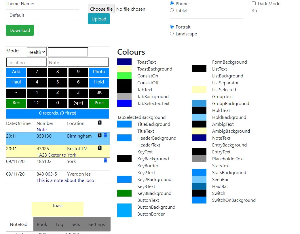
- Choose a name for your new theme: edit the theme name in the input field below "Theme Name"
Saving your theme
To save your theme:
- Click "Download" - the webpage will download your theme file. You can save the theme file for later use, or load the theme file onto your device and add it to SpotLog themes (see https://spotlog.org/spotlogv5/Themes).
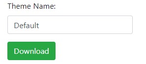
Loading an existing theme
To upload an existing custom theme and edit it:
- Click "Choose file" and browse to the theme file on your computer.
- Click "Upload"
The editor loads the theme and updates the preview window.
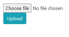
Device, Orientation and Dark mode
The editor will preview how SpotLog will render the theme in different device types (Phone or Tablet), orientation, and dark mode on or off.
Use the controls to select "Phone" or "Tablet", "Portrait" or "Landscape" and dark mode on or off.
"Dark mode" will switch the colour palette to the dark mode colours for the theme.
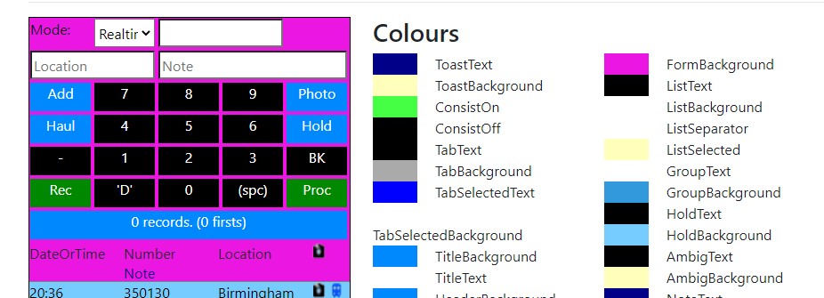
Colour Palette
SpotLog Themes are driven by colour palettes. Whilst it is possible to set a colour directly on a theme component (eg a button) it is better to use the colour palette and a named colour.
The editor displays the current palette loaded.
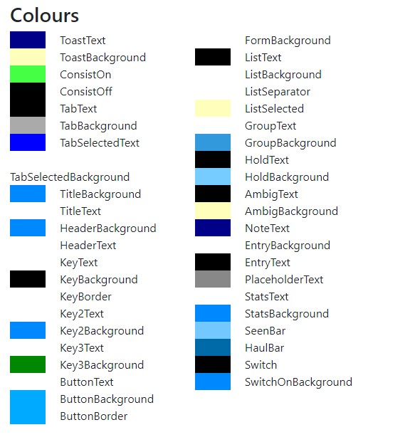
You can edit the colours in the palette:
- Click on the colour swatch to the left of each colour name
- A colour picker opens: use the picker to select the colour you want
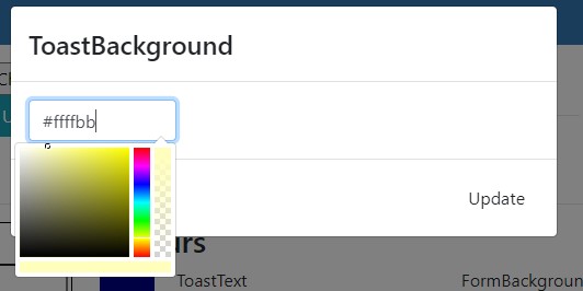
- You can also type in the colour hex code if you prefer
- Click "Update" to update the palette
- The preview will redraw to show the changes.
Example:
- Click the swatch next to "FormBackground"
- Click on the purple part of the vertical "Rainbow" bar
- Click in the square to select the actual purple shade
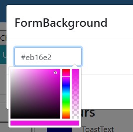
- Click Update
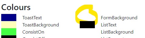
- The preview redraws:
Lovely!
Note: not all the colours in the palette are used on the NotePad page: some will be used in the book/ log etc. The editor does not show these pages yet - please let us know if you find the editor useful and would use the other page views if they were added.
Editing the Keypad
The editor allows you to edit the layout of the keys and fields on the keypad.
- Click one of the buttons/entry fields
- The button editor form opens:
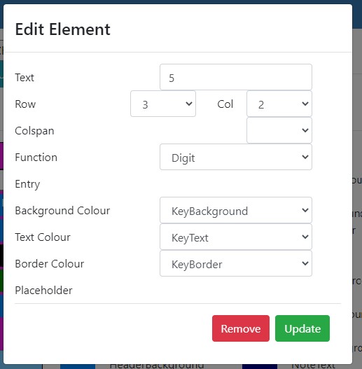
- "Text" is the text shown on the button
- "Row" and "Column" are the position of the button or label in the grid, the top, left hand corner of the grid is row 0 column 0
- A button or field may span multiple columns, the "Colspan" field lets you set this. (see the stat row for an example of colspan)
- "Function" controls what the button does:
- "Digit" enters the text on the button into the number field
- "Space" enters a space into the number field
- "Back" backspaces the number field
- "Add" adds a record
- "AddHaul" adds a record with Haulage
- "AddHold" adds a record and sets the record to Hold
- "AddPhoto" adds a record with Photo
- "Process" initiates processing
- "Prefix" enters a prefix into the number
- "Con" turns on/off consist mode
- "Entry" is used for entry fields, and controls which record term they input
- "Background Colour" lets you choose a colour from the palette for the button or input background
- "Border Colour" lets you choose a colour from the palette for the button or input border
- "Text Colour" lets you choose a colour from the palette for the button or input text
- "Placeholder" is used with entry fields and specifies the placeholder text for the input
- "Update" updates the button/field with the new settings and redraws the preview
- "Remove" removes the button/field from the notepad and redraws the preview
With these controls you can change the layout of the notepad, colours etc
Editing the list layout
You can also edit the layout of the list:
- click on the list preview to edit the list fields
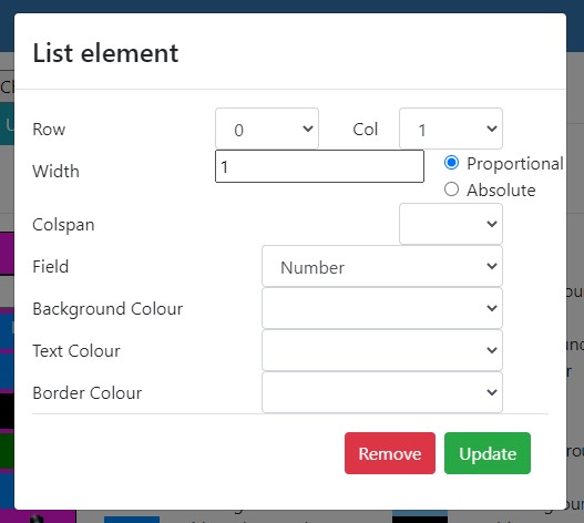
- "Row" and "Column" specify the position in the entry grid (you should only use rows 0 and 1)
- "Colspan" can be used to allow fields to span columns
- "Width" is the width of the column: Width can either be proportional or absolute
- Absolute width specifies the column width in pixels
- Proportional width sets the column width as a proportion of the available space
- In the default theme, the widths are
- Date/Time: Proportional 1
- Number: Proportional 1
- Location: Proportional 1
- Camera icon: Absolute: 20 pixels
- Train icon: Absolute: 20 pixels
- "Field" specifies which field of the data is displayed
- "Background Colour" lets you choose a colour from the palette for the item
- "Border Colour" lets you choose a colour from the palette for the item
- "Text Colour" lets you choose a colour from the palette for the item
Note, generally it is best not to specify background colour for a notepad list item as the app uses different background colours to show if a record is held, ambiguous etc. If you specify a background colour for a field, this will overwrite the status colouring. You can edit the colours "HoldBackground" "AmbigBackground" etc in the palette.